
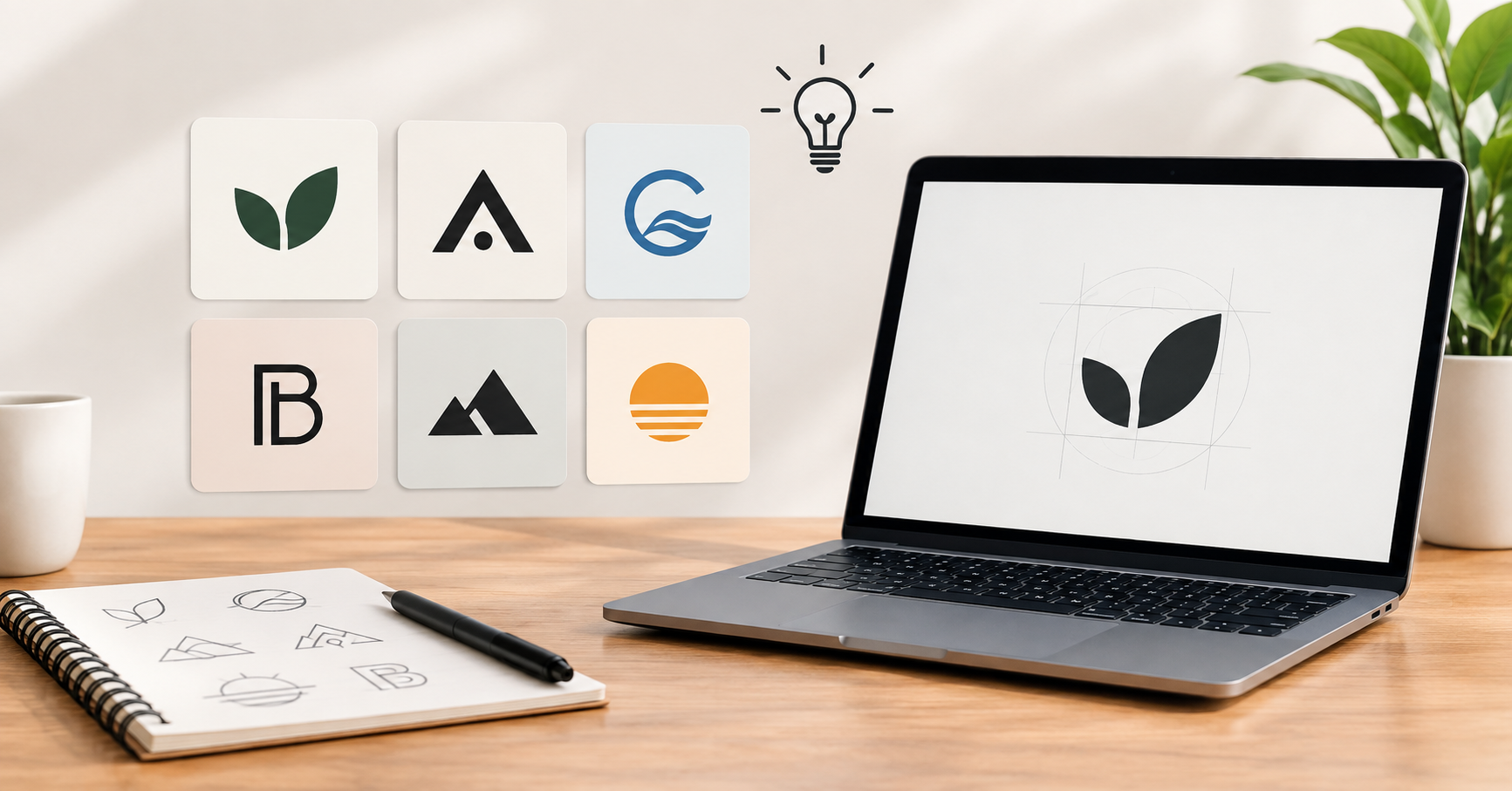

A logo has a few seconds to tell a stranger who you are. For a small business without a large design budget, minimalism is a practical choice. Clean shapes, limited colors, and plenty of white space make a logo easier to recognize, cheaper to print, and simple to use on everything from a shop sign to a social media avatar.
AI image tools can now generate logo concepts in seconds, but the quality of the result depends on the prompt. A vague request produces a cluttered, generic image, while a specific one produces something you can build a brand around. This guide shows how to write minimalist logo prompts that work, with examples for different types of small businesses.
Why Minimalism Suits Small Businesses
Minimal logos stay legible at any size. A detailed illustration may look impressive on a poster but turn to mush as a 32-pixel favicon. A simple mark holds up on a business card, a delivery box, an embroidered apron, or a phone screen.
They also age well. Trends in gradients and effects come and go, but a well-proportioned shape in one or two colors rarely looks dated. And because they are simple, they are cheaper to reproduce, since fewer colors mean lower printing costs on stamps, stickers, and packaging.
The Anatomy of a Good Logo Prompt
Most strong prompts contain the same five ingredients:
- Logo type: wordmark, lettermark, symbol, or combination mark.
- Subject: what the business does or what it wants to suggest.
- Style keywords: flat, geometric, line art, negative space, monoline.
- Color instructions: a strict palette, or “black on white.”
- Constraints: what to leave out, such as gradients, shadows, or textures.
A reusable template looks like this:
Minimalist [logo type] for a [business type] called “[name]”, featuring [simple symbol or idea], [style keywords], [color palette], plain white background, vector style, no gradients, no shadows.
Fill in the brackets and you have a solid starting point. The phrase “plain white background” matters more than it seems, because it keeps the tool from adding scenery that you would then have to remove.
Prompt Examples by Business Type
Coffee Shops and Cafés
Minimalist logo for a neighborhood coffee shop called “Morning Ember,” a simple circle suggesting a rising sun with a single curved line forming a coffee cup, warm terracotta and cream, flat vector style, white background, no gradients.
Freelance Consultants and Coaches
Minimalist lettermark logo using the initials “RK” for a business consultant, interlocking geometric letters, deep navy on white, clean sans-serif, professional and calm, vector, no shadows.
Handmade Goods and Craft Sellers
Simple monoline logo for a handmade candle brand called “Wick & Willow,” a single leaf wrapped around a flame outline, soft sage green, thin uniform line weight, lots of white space, flat design.
Fitness Studios and Personal Trainers
Bold minimalist symbol logo for a yoga studio called “Still Point,” an abstract figure in balance formed from three overlapping circles, charcoal and pale gold, geometric, centered composition, white background.
Local Service Businesses
Minimalist combination mark for a plumbing company called “ClearFlow Plumbing,” a simple water droplet with a straight horizontal line through it, two-color blue and gray, sturdy sans-serif wordmark beside the icon, flat vector style.
Online Shops and Boutiques
Elegant wordmark logo for a small skincare boutique called “Petal & Pine,” lowercase serif lettering with generous letter spacing, single small dot above the “i,” black text on off-white background, no icon.
Style Keywords That Push Results Toward Minimalism
Some words reliably steer AI tools toward simpler output:
- Geometric: builds the mark from circles, triangles, and squares.
- Monoline: keeps every stroke at the same thickness.
- Negative space: hides a second shape in the gaps of the first.
- Flat design: removes depth, shading, and texture.
- Balanced symmetry: gives a stable, professional feel.
- Two-color or single color: limits the palette to keep the design disciplined.
Use two or three of these per prompt. Stacking ten of them tends to confuse the tool rather than sharpen the result.
Words to Exclude
Telling the tool what to avoid is as useful as telling it what to include. Add phrases such as “no gradients,” “no photorealism,” “no 3D effects,” “no drop shadows,” “no tiny details,” and “no extra text.” If your tool has a negative prompt field, put these there instead.
Be careful with text. Many image generators still misspell words inside logos, especially longer business names. If the lettering comes out garbled, generate the symbol alone and add the name yourself in a font editor or design app, which also gives you more control over spacing.
How to Refine Your Results
Your first output is rarely the final logo. Treat it as a rough sketch and change one variable at a time:
- If the mark feels too busy, add “fewer elements” or “single simple shape.”
- If it looks generic, name a specific concept, such as “a fox tail curving into a flame,” instead of “animal.”
- If the color feels off, specify exact tones such as “muted olive” or “dusty rose” rather than “green” or “pink.”
- If the composition is uneven, ask for “centered, symmetrical layout.”
Generate several variations, then compare them at a small size. Shrink each one to roughly the size of a social media profile picture. If you can still tell what it is, it passes.
Practical Checks Before You Commit
A good concept still needs testing before it goes on your storefront:
- Test it in black and white. A strong logo works without color.
- Check it on light and dark backgrounds. You will need both versions.
- Search for similarities. Look through trademark databases and image search to make sure your design does not closely resemble an existing brand.
- Confirm usage rights. Read your AI tool’s terms to see whether you can use generated images commercially, and whether you can trademark the result.
- Convert to vector. A clean SVG or vector file scales to any size, and printers and sign makers will ask for one.
Common Mistakes to Avoid
The most frequent error is describing the business instead of the brand. “A logo for a bakery” gives the tool nothing to work with. Say what feeling you want, such as warm, modern, playful, or trustworthy.
Another is chasing complexity. If your prompt describes a scene with a person, a building, and a sunset, it is no longer a minimalist logo. Pick one idea and express it simply.
Finally, do not skip the human step. AI produces starting points, but a designer’s eye for spacing, alignment, and typography is what turns a decent concept into a finished brand asset. Even a light manual cleanup can make a large difference.
Final Thoughts
Minimalist logos work for small businesses because they are clear, flexible, and affordable to use. With a structured prompt covering logo type, subject, style, color, and exclusions, you can produce usable concepts in minutes instead of weeks. Start with the template above, adapt one of the examples to your own business, and refine patiently. The goal is a mark that people recognize at a glance.



Leave a Reply